Vuetify2からVuetify3で仕様が変わって、デザインが崩れたり表示が変わったりしているので対応して行きます。
アップグレードガイドと各APIやコンポーネントのページを確認しながら進めるのが良いのですが、手間なので私が使っている所だけですが、変更点をメモしておきます。
前回:Nuxt BridgeをNuxt3に移行。Vuetify3のテーマと色を設定+確認ページ作成
【Vuetify3】Upgrade guide — Vuetify
【Vuetify2】Vuetifyを始めましょう — Vuetify
- 【追記】eslint-plugin-vuetifyで自動修正
- これまでに対応したVuetify2 -> Vuetify3の変更まとめ
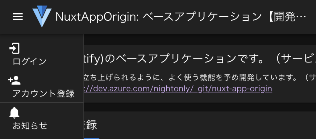
- 左メニューがコンテンツの上に表示される(v-navigation-drawer)
- メニュー項目のアイコンと文字が2段になる(v-list-item)
- badgeに0が表示される。v-list-item-title内だと上が切れる(v-badge)
- ヘッダのアイコンが小さくなった(v-app-bar内のv-icon)
- リストのroundedが効かなくなった(v-list)
- サイズのsmall/medium/largeが効かなくなった(全体)
- chipのデフォルトデザインが変わった(v-chip)
- alertのマージンが無くなった(v-alert)
- タイトルが長い場合、省略されるように変更されている(v-card-title)
- ボタンのdisabledの色が変更されている(v-btn)
- ボタンの上や右のマージンが無くなった(v-btn)
- ダイアログのタイトルがズレ、ボタンがフラットになる(v-dialog)
- card-actions内のul/liに・が付かなくなった(v-card-actions)
- タブが切り替えで表示が変わらない。選択時の色がなくなった(v-tab)
- classで指定した色が変わらない(xxx–text等)
- その他、無くなったPropsを変更または削除
- [Vue warn]: Extraneous non-emits event listeners…
- [Vue warn]: Extraneous non-props attributes (class)…
- 【次回】VitestとVue Test Utilsを導入
- 今回のコミット内容
【追記】eslint-plugin-vuetifyで自動修正
lintで、定義の変更は自動で直せるようです。ただ、デザイン崩れはそれぞれ対応が必要そう。
% yarn add -D eslint-plugin-vuetify
.eslintrc.js
  extends: [

+    'plugin:vue/base',
+    'plugin:vuetify/base'
  ],
% yarn lint --fix
これまでに対応したVuetify2 -> Vuetify3の変更まとめ
- Vuetifyを導入
- Vuetify: $vuetify.breakpoint.width -> $vuetify.display.width
- v-on with no argument expects an object value. -> #activator
- v-dialogが表示されない -> #default
- v-paginationが動かない。@input -> @click
- Nuxt BridgeをNuxt3に移行。Vuetify3のテーマと色を設定+確認ページ作成
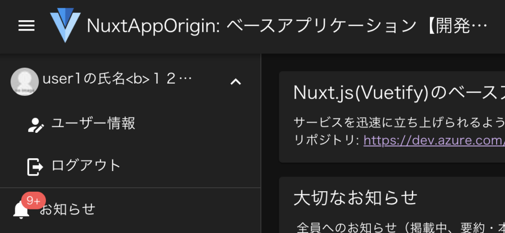
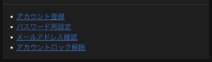
左メニューがコンテンツの上に表示される(v-navigation-drawer)
| before | after |
 |
 |
layouts/default.vue
-    <v-app-bar clipped-left fixed app>
+    <v-app-bar>

-    <v-navigation-drawer v-model="drawer" width="300px" clipped fixed app>
+    <v-navigation-drawer v-model="drawer" width="300">
v-navigation-drawerのwidthの’px’を削除すればOK!
Vuetify2では問題なかったのですが、Vuetify3ではダメみたい。
序でに無くなったPropsを削除しています。
VAppBar API — Vuetify
VNavigationDrawer API — Vuetify
Layout -> Upgrade guide — Vuetify
'stateless', 'clipped', 'clipped-right' and 'app' props have been removed
 from v-navigation-drawer, v-app-bar and v-system-bar.
 The position in the markup determines the appearance.
 Use the 'order="number"' prop to influence it manually.
v-navigation-drawer, v-app-bar, v-system-barから、stateless, clipped, clipped-right, appが削除されています。
表示は記載した順番になるようです。orderで制御できそうですが、想定と違う場所に表示されていたら、記載場所を直した方が直感的で解りやすくなりそう。
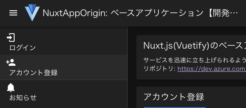
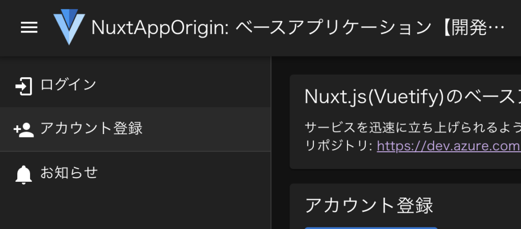
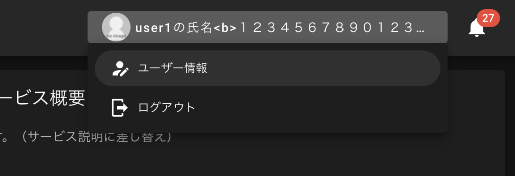
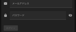
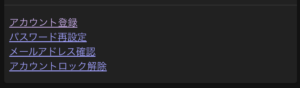
メニュー項目のアイコンと文字が2段になる(v-list-item)
| before | after |
|
 |
layouts/default.vue
-        <v-menu offset-y>
+        <v-menu>

          <v-list-item to="/users/sign_in" nuxt>
-            <v-icon>mdi-login</v-icon>
-            <v-list-item-title class="ml-2">ログイン</v-list-item-title>
+            <v-list-item-title>
+              <v-icon>mdi-login</v-icon>
+              ログイン
+            </v-list-item-title>
          </v-list-item>
v-iconやv-avatarをv-list-item-titleの外に入れてましたが、中に移動すればOK!
Vuetify2だと外じゃないと崩れたような。
また、スペースが調整されているので、調整で入れていたclass=”ml-2″とかを削除しました。
序でに無くなったPropsを削除しています。
VMenu API — Vuetify
v-menu -> Upgrade guide — Vuetify
'offset-y' and 'offset-x' props have been removed. Use 'offset' prop instead
v-menuのoffset-y, offset-xは削除されています。必要な場合はoffsetで設定する。
それでも2段になる場合は、class=”d-flex”を追加すればOK!
              <v-list-item v-bind="props">
-                <v-avatar size="32px">
-                  <v-img id="user_image" :src="$auth.user.image_url.small" />
-                </v-avatar>
-                <v-list-item-title>
+                <v-list-item-title class="d-flex">
+                  <v-avatar size="32px">
+                    <v-img id="user_image" :src="$auth.user.image_url.small" />
+                  </v-avatar>
                  <div class="text-truncate ml-1">{{ $auth.user.name }}</div>
                </v-list-item-title>
              </v-list-item>
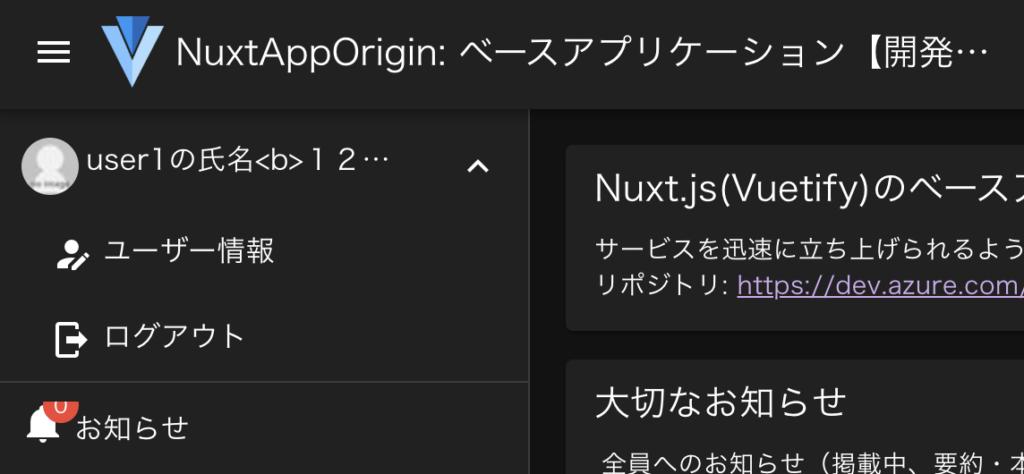
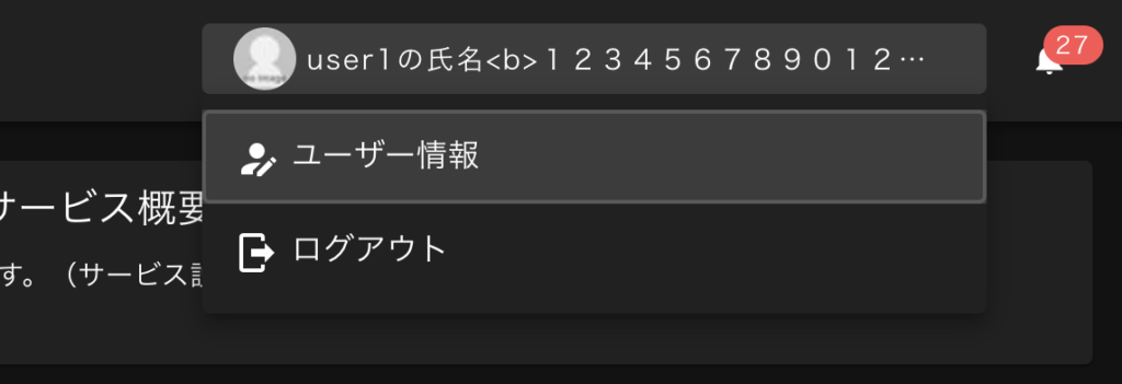
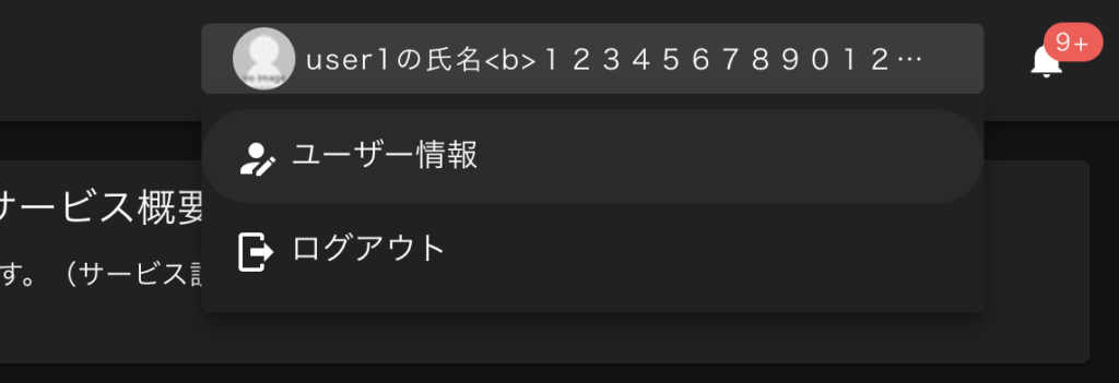
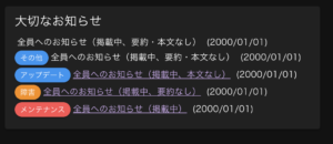
badgeに0が表示される。v-list-item-title内だと上が切れる(v-badge)
| before | after |
 |
 |
layouts/default.vue
          <v-list-item-title>
            <template v-if="$auth.loggedIn">
              <v-badge
                :content="$auth.user.infomation_unread_count"
-                :value="$auth.user.infomation_unread_count"
+                :model-value="$auth.user.infomation_unread_count"
+                :model-value="$auth.user.infomation_unread_count > 0"
+                max="9"
-                color="red"
+                color="error"
-                overlap
+                class="list-badge"
              >
                <v-icon>mdi-bell</v-icon>
              </v-badge>
-              お知らせ
+              <span class="ml-8">お知らせ</span>

<style scoped>
+ .list-badge {
+   position: absolute; /* NOTE: v-list-item-titleでv-badgeの上が隠れてしまう為 */
+ }
0が表示されるは、valueをmodel-valueしてに変更して、Booleanを返してあげればOK!
maxやcolorは改善の為に変更しています。
[Vue warn]: Invalid prop: type check failed for prop "modelValue".
 Expected Boolean, got Number with value 0.
v-list-item-title内だと上が切れるは、overlapがなくなったからかと思います。
最初、z-indexを試しましたが、v-list-item-titleのpositionの影響を受けて効かない。
なので、absoluteに変更しました。ただ、右の文字列(お知らせ)の起点が左隅になり重なってしまうので、class=”ml-8″を追加して調整しました。もっと良いやり方ないのかな?
【Vuetify3】VBadge API — Vuetify
【Vuetify2】v-badge API — Vuetify
ヘッダのアイコンが小さくなった(v-app-bar内のv-icon)
通常のv-iconのサイズはVuetify2の時と変わりませんが、v-app-bar内は小さくなります。
好みなので、変えなくてもOKですが、
badgeが付いた場合はアイコンが解りにくいので、そこだけ対応する事にしました。
| before(Vuetify2) | after(Vuetify3) |
 |
 |
 |
 |
layouts/default.vue
    <v-app-bar>

          <v-badge
            :content="$auth.user.infomation_unread_count"
            :model-value="$auth.user.infomation_unread_count"
            max="9"
            color="error"
          >
-            <v-icon>mdi-bell</v-icon>
+            <v-icon size="large">mdi-bell</v-icon>
          </v-badge>
v-app-bar内のv-iconでsizeを指定すればOK!
同じ大きさにするならx-largeだけど、少し小さくしたいのでlargeにしました。
sizes: 'x-small', 'small', 'default', 'large', and 'x-large'.
リスト選択項目のroundedが効かなくなった(v-list)
darkモードなので解りにくいですが、リスト選択項目が丸く囲んでいたのが四角になりました。
また、項目が全体的に大きくなっていますが、見やすいと思うので、そのままにします。
| before(Vuetify2) | after(Vuetify3) |
|
 |
layouts/default.vue
-          <v-list dense rounded>
+          <v-list>
-            <v-list-item to="/users/update" nuxt>
+            <v-list-item to="/users/update" nuxt rounded="xl">
              <v-list-item-title>
                <v-icon>mdi-account-edit</v-icon>
                ユーザー情報
              </v-list-item-title>
            </v-list-item>
v-listの’rounded’を削除して、v-list-itemに’rounded=”xl”‘を追加すればOK!
序でに無くなったPropsを削除しています。
VList API — Vuetify
VListItem API — Vuetify
after(修正後)
サイズのsmall/medium/largeが効かなくなった(全体)
General changes -> Upgrade guide — Vuetify
Size props 'small' / 'medium' / 'large' etc. have been combined into a single 'size' prop.
全体的に、下記のように変更すればOK
small -> size=”small”
medium -> size=”medium”
large -> size=”large”
  <v-chip
-    small
+    size="small"
  >
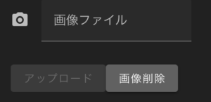
chipのデフォルトデザインが変わった(v-chip)
※色は下記で変更しています。
→ Nuxt BridgeをNuxt3に移行。Vuetify3のテーマと色を設定+確認ページ作成
| Vuetify2 | Vuetify3 |
 |
 |
components/infomations/Label.vue
  <v-chip
+    variant="elevated"
  >
variant=”elevated”を追加すればOK!
variant -> VChip API — Vuetify
Type: 'text' | 'flat' | 'elevated' | 'tonal' | 'outlined' | 'plain'
Default: 'tonal'
after(修正後)
alertのマージンが無くなった(v-alert)
| before(Vuetify2) | after(Vuetify3) |
 |
 |
  <v-alert
    type="warning"
+    class="mb-4"
  >
class=”mb-4″を追加すればOK!
但し、マージンが少ない方が良い場合は、”mb-2″等を追加。
序でに、v-row/v-colでマージンを調整していた所を削除しました。
v-alertと位置がズレたのと、指定しなくても綺麗に表示されるようになった気がするので。
pages/index.vue
-  <v-row class="pt-2">
+  <v-row>
-    <v-col cols="12" md="12" class="px-2 py-2">
+    <v-col cols="12" md="12">
序でにリファクタ:下記で検索(正規表現)して、対象を置換しました。
px-.* py-.*
py-.* px-.*
mx-.* my-.*
my-.* mx-.*
px-0 py-0 -> pa-0
mx-2 my-2 -> ma-2
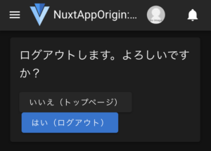
タイトルが長い場合、省略されるように変更されている(v-card-title)
| before(Vuetify2) | after(Vuetify3) |
 |
 |
下記CSSが追加されたのが原因なので、normalに変更すればOK!
.v-card-title {
  white-space: nowrap;
layouts/default.vue
<style>
+ .v-card-title {
+   white-space: normal; /* NOTE: 文字が省略され、折り返されない為 */
+ }
styleはあえてscoped付けないで、全ページに適用されるようにしています。
序でに改善。
未指定だったcolorの追加と、折り返された場合にスペースが適切に開くように変更しました。
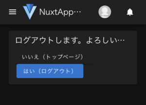
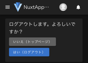
pages/users/sign_out.vue
      <v-btn
+        color="secondary"
        to="/"
        nuxt
+        class="mb-2 mr-1"
      >
        いいえ(トップページ)
      </v-btn>
      <v-btn
        id="sign_out_btn"
        color="primary"
-        class="ml-1"
+        class="mb-2"
        :disabled="processing"
        @click="signOut()"
      >
        はい(ログアウト)
      </v-btn>
after(修正後)
ボタンのdisabledの色が変更されている(v-btn)
綺麗なんだけど、押せると誤解しそうなので、変更しました。
| before(Vuetify2) | after(Vuetify3) |
 |
 |
layouts/default.vue
<style>
+ .v-btn--disabled.v-btn--variant-elevated { /* NOTE: disable時に押せると誤解する為 */
+   background-color: transparent !important;
+   color: rgba(var(--v-theme-on-surface), 0.26) !important;
+ }
styleはあえてscoped付けないで、全ページに適用されるようにしています。
after(修正後)
ボタンの上や右のマージンが無くなった(v-btn)
| before(Vuetify2) | after(Vuetify3) |
 |
 |
 |
 |
          <v-btn
+            class="mt-4"

        <v-btn
-          class="mt-2"
+          class="mt-2 mr-2"
それぞれ調整すればOK!
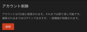
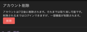
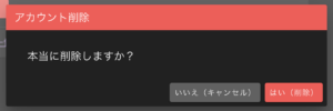
ダイアログのタイトルがズレ、ボタンがフラットになる(v-dialog)
| before(Vuetify2) | after(Vuetify3) |
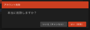 |
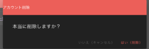 |
pages/users/delete.vue
      <v-dialog transition="dialog-top-transition" max-width="600px">

        <template #default="{ isActive }">
          <v-card>
-            <v-toolbar color="error" dense>アカウント削除</v-toolbar>
+            <v-toolbar color="error" density="compact" title="アカウント削除" />
+            <v-toolbar color="error" density="compact">
+              <span class="ml-4">アカウント削除</span>
+            </v-toolbar>
            <v-card-text>
              <div class="text-h6 pa-4">本当に削除しますか?</div>
            </v-card-text>
-            <v-card-actions class="justify-end">
+            <v-card-actions class="justify-end mb-2 mr-2">
              <v-btn
                color="secondary"
+                variant="elevated"
                @click="isActive.value = false"
              >
                いいえ(キャンセル)
              </v-btn>
              <v-btn
                color="error"
+                variant="elevated"
                @click="postUserDelete(isActive)"
              >
                はい(削除)
              </v-btn>
v-toolbarの「dense」を「density=”compact”」に変更し、文言をtitle=””の中に移動、
v-btnは’variant=”elevated”‘を追加すればOK!
General changes -> Upgrade guide — Vuetify
'dense' prop on components such as v-select, v-btn-toggle, v-alert, v-text-field,
 v-list and v-list-item has been changed to 'density' prop with the variants
 'default', 'comfortable', 'compact'
after(修正後)
card-actions内のul/liに・が付かなくなった(v-card-actions)
ここはこのままでも良さそう。出したい場合は、v-card-textに変更する等で対応可能。
表示した事があるページのリンク色が変わるようになったのも良いですね。
| Vuetify2 | Vuetify3 |
 |
 |
タブが切り替えで表示が変わらない。選択時の色がなくなった(v-tab)
[Vue Router warn]: Couldn't find element using selector "#active" returned
 by scrollBehavior.
hrefだと、v-modelの値(tabPage)が連番になるように変わっているようです。valueに変更。
色はデフォルトが変わったようなので、明示します。
-      <v-tabs v-model="tabPage">
+      <v-tabs v-model="tabPage" color="primary">
-        <v-tab href="#active">スペース設定</v-tab>
+        <v-tab value="active">スペース設定</v-tab>
VTabs API — Vuetify
VTab API — Vuetify
classで指定した色が変わらない(xxx–text等)
Theme -> Upgrade guide — Vuetify
Color classes have been renamed:
・Backgrounds have a 'bg-' prefix, for example '.primary' is now '.bg-primary'.
・Text colors have a 'text-' prefix, for example '.primary--text' is now '.text-primary'.
・Variants are no longer a separate class, for example '.primary--text.text--darken-1' is now '.text-primary-darken-1.'
「grey–text」だった場合、「text-grey」になる。
-  <span class="align-self-center mr-3 grey--text">{{ $timeFormat('ja', space.created_at, 'N/A') }}</span>
+  <span class="align-self-center mr-3 text-grey">{{ $timeFormat('ja', space.created_at, 'N/A') }}</span>
どうせならと、見た目が良くなるように、必須の赤の[*]はchipに変更しました。
序でに、v-text-fieldやv-radioの高さが少し大きくなっているので、位置もズラしています。
-  <v-col cols="auto" md="2" class="d-flex justify-md-end text-no-wrap pr-0 pb-0 mt-2">
+  <v-col cols="auto" md="2" class="d-flex justify-md-end text-no-wrap pr-0 pb-0 mt-3">
-    名称 <span class="red--text">*</span>
+    名称<v-chip color="accent" size="x-small" variant="elevated" class="ml-1" style="top: 1px">必須</v-chip>
+    名称<AppRequiredLabel />

-    説明
+    説明<v-chip color="secondary" size="x-small" variant="elevated" class="ml-1" style="top: 1px">任意</v-chip>
+    説明<AppRequiredLabel optional />

<script>
+ import AppRequiredLabel from '~/components/app/RequiredLabel.vue'

export default defineNuxtComponent({
  components: {
+    AppRequiredLabel,
↓は今後書き換えなくて良いように、最初からComposition API+TypeScriptで書きました。
components/app/RequiredLabel.vue
<template>
  <v-chip
    :color="optional ? 'secondary' : 'accent'"
    size="x-small"
    variant="elevated"
    class="ml-1"
    style="top: 1px"
  >
    {{ optional ? '任意' : '必須' }}
  </v-chip>
</template>

<script setup lang="ts">
defineProps({
  optional: {
    type: Boolean,
    default: false
  }
})
</script>
styleは文字と1pxずれるので追加しています。
その他、無くなったPropsを変更または削除
無くなったのは無視されるだけなので、動作に影響ないですが、気持ち悪ので削除、
変わった所(色やマージンも)は変更しておきます。
- <v-footer absolute inset app>
+ <v-footer absolute app>
- <v-icon dense>mdi-account-plus</v-icon>
+ <v-icon>mdi-account-plus</v-icon>
or
+ <v-icon size="small">mdi-account-plus</v-icon>
or
+ <v-icon size="x-small">mdi-account-plus</v-icon>
- <v-alert type="info" dense>
+ <v-alert type="info" density="compact">
<v-btn
- dense
- fab
+ icon
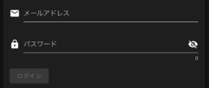
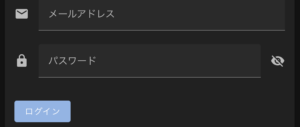
<v-text-field
- dense
+ density="compact"
- outlined
+ variant="outlined"
<v-checkbox
+ color="primary"
- dense
+ density="compact"
- input-value="1"
- @click="waiting = false"
+ @update:model-value="waiting = false"
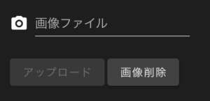
<v-file-input
+ class="mt-2"
+ density="compact"
- outlined
+ variant="outlined"
<v-radio-group
+ color="primary"
- dense
+ density="compact"
- row
+ inline
+ @update:model-value="waiting = false"
<v-radio
+ class="mr-2"
- @change="waiting = false"
<v-switch
- dense
+ density="compact"
<style>
+ .v-input--density-compact {
+ --v-input-control-height: 32px; /* NOTE: v-switchの高さが40pxだと大きい為 */
+ }
- <v-overlay absolute>
+ <v-overlay model-value contained persistent scrim="secondary" class="align-center justify-center">
<v-progress-circular indeterminate color="primary" :size="50" />
</v-overlay>
VFooter API — Vuetify
VIcon API — Vuetify
VBtn API — Vuetify
VRadioGroup API — Vuetify
VOverlay API — Vuetify
[Vue warn]: Extraneous non-emits event listeners…
Vuetifyとは関係ないけど、下記warnが出てたので対応しました。問題なく動作はします。
[Vue warn]: Extraneous non-emits event listeners (alert, notice) were passed
 to component but could not be automatically inherited
 because component renders fragment or text root nodes.
 If the listener is intended to be a component custom event listener only,
 declare it using the "emits" option.
Options API/JavaScriptのままですが、Vue3では$emitする場合、
      this.$emit('alert', this.appGetAlertMessage(data, require, defaultKey))
      this.$emit('notice', data?.notice || null)
対象を明示してあげる必要があります。
utils/application.js
export default defineNuxtComponent({
+  emits: ['alert', 'notice'],
[Vue warn]: Extraneous non-props attributes (class)…
こちらもVuetifyとは関係ないけど、下記warnが出てたので対応しました。
[Vue warn]: Extraneous non-props attributes (class) were passed to component
 but could not be automatically inherited because component renders fragment
 or text root nodes.
  at <IndexPublicSpace class="pt-2" >
Componentでclass指定ができなくなったとの事。
-      <IndexPublicSpace class="pt-2" />
+      <div class="pt-2">
+        <IndexPublicSpace />
+      </div>
【次回】VitestとVue Test Utilsを導入
結構、多かったです。
before/afterを見比べて、気になる所を直していく地道な作業が必要になります。
一部でもこれを参考にして、調査の手間が省ければ幸いです。
次回はいよいよ最難関?の、VitestとVue Test Utilsの導入に挑戦しようと思います。
→ Nuxt BridgeをNuxt3に移行。VitestとVue Test Utilsを導入
今回のコミット内容
origin#507 Vuetifyのデザイン崩れを直す
origin#507 Nuxt3・warn対応、デザイン調整・改善、暫定対応
origin#507 eslint-plugin-vuetify導入、lint fix